As the UX Design Lead for Agilent's Cell Analysis division, I worked hand in hand with the product management and dev team in an Agile environment on the development of their new web-based analysis program. This was a new application that we built from the ground up, intentionally departing from the existing desktop software in an effort to improved usability based on feedback from diverse stakeholders including Field Application Scientists, customer interviews, technical support, internal BioApps team and marketing.
Below, I will show the process from start to finish to show the true breadth of the design process, looking beyond just UI to the entire Human Centered Design Process.
User Research
Ideally, any UX project should start with research. Customer interviews should discover user needs and the UX professional should use them to create user requirements that define how the product is designed.
When we started this project, we didn't have the access to conduct the interviews as we would have liked. However, we had many years of feedback on the existing Wave Desktop application we were looking to improve. This included input from Field Application Scientists, customer interviews, technical support as well as new sessions with our internal BioApps team and marketing. It was this process that led our team to identify the user needs.
Ideation
We wanted to make sure that we had a versatile platform that met the user's needs so we started ideation nearly a year before we planned to begin dev.
It was during in-person and remote meetings where we defined the information architecture for the project. I love a good white board session. In these sessions, we hashed out not only the general structure of the IA, but also the way that data would be organized.
Figure top right: In this session, we defined the widget-based idea for the IA that would allow users to mix a match graphs in a single, customizable view. This would become the foundation of the new platform.
Figure bottom right: In this session, we discussed what information should be presented to the user in the view. Our mantra at the UDC is, "Simplify. Only present to the user the information that they need at that moment."
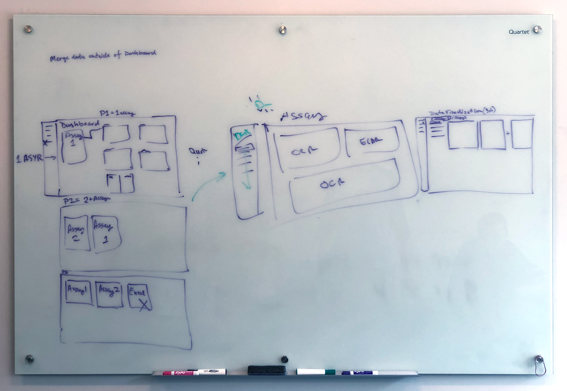
In this session, we defined the widget-based idea for the IA that would allow users to mix a match graphs in a single, customizable view. This would become the foundation of the new platform.
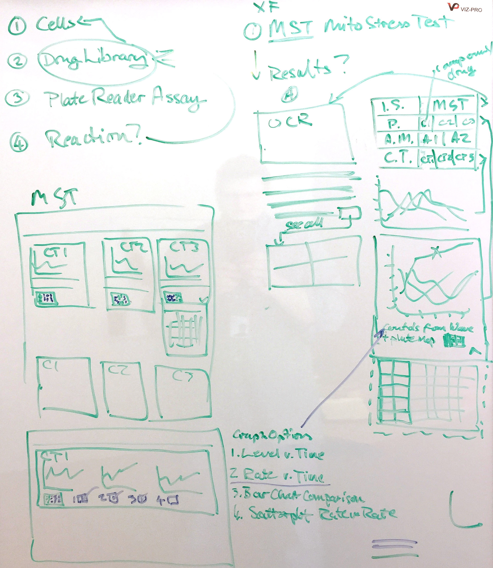
In this session, we discussed what information should be presented to the user in the view. Our mantra at the UDC is, "Simplify. Only present to the user the information that they need at that moment."
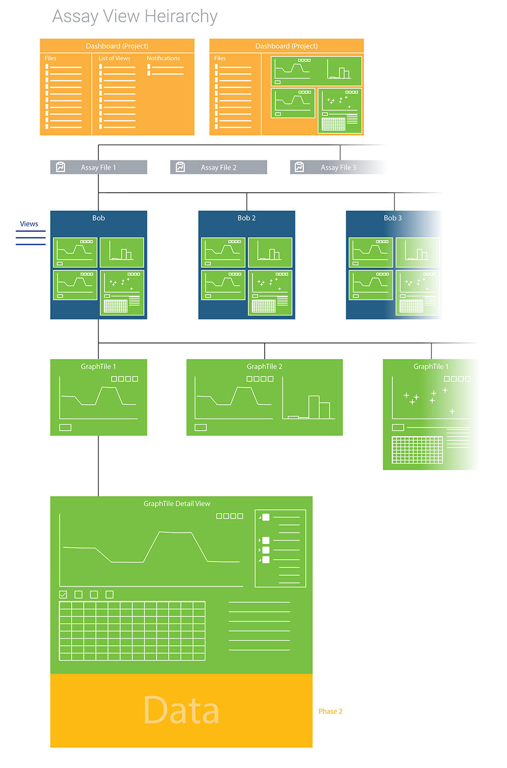
These whiteboards were turned into a document that we used to define how the customer's data was organized. On the right you can see how ultimately organized the environment. At that time we were calling them Graph Tiles, but would end up renaming them Widgets in the Market Release version.
This graphic shows the hierarchy for how we organized the customer's assay data. The color coding gives a visual overview of where the data would be organized as well as how the IA would accommodate features intended for future releases of the application.
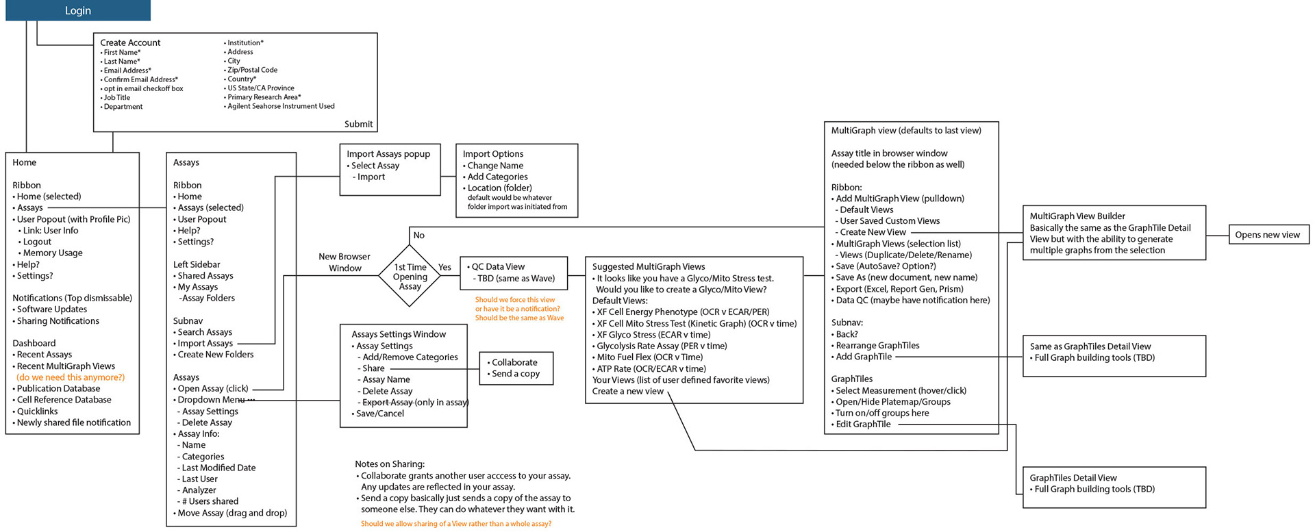
The hierarchy graphic led us to create the diagram below. It allowed the team to discuss what features and functionality we needed to plan for in the UX before we started UI design.
Initial Designs
Unfortunately, due to Agilent Confidentiality, I am unable to show early versions of the software UI created during that phase of development as it shows un-released concepts that are Agilent's intellectual property. However, below I have a few screens of the final designs that have been previously shared publicly.
The Presentation
These initial designs were used in a presentation that I helped Project Management to create (which is also, unfortunately, Agilent IP and I cannot share). It was presented as a Project to senior management with the intended kickoff date over a year away. It was so well received that they not only approved the project but requested that we kick it off immediately.
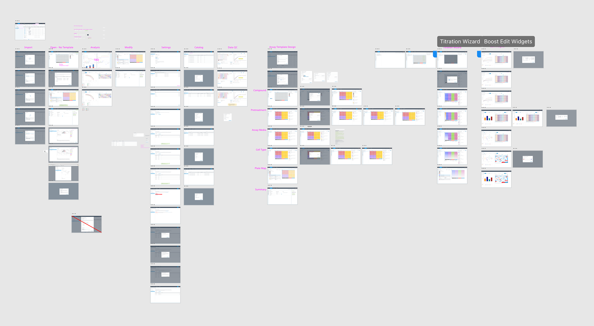
Hi-Fidelity Prototyping
The initial designs for Seahorse Analytics were created in Illustrator and published as an inVision App interactive prototype. Since then, we have used Adobe XD and now Figma using a design system.
The hi-fidelity prototyping was something that was new to the Seahorse team when I began working with them. It completely changed the dynamic of their software development as it allowed us to find UX problems long before coding started. We even use them in many of our usability tests.
Below are some high-level overviews of the prototypes created for the future releases of the software using Adobe XD. Using multiple screens and complex interactive components, I was able to emulate the experience of live software. Interactions ranged from simple buttons to highly complex interactive components that simulate operational software. In the example below you can get an idea of the complexity. The working file is shown with and without the prototype actions.
Usability Testing
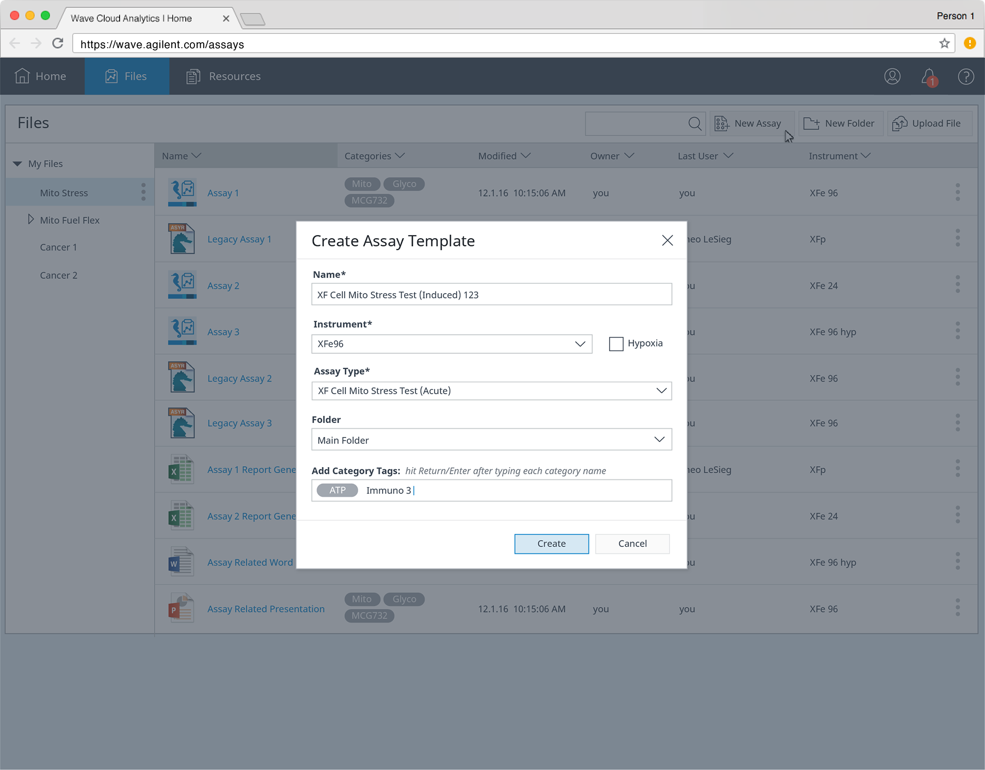
An integral part of developing software with the Human Centered Design process, is usability testing. In the second release, we completely redesigned the way that users design assays. We called it the Plate Assay Builder. Because it was so different from the previous UI, it was essential that we test the prototypes with actual users before going to code.
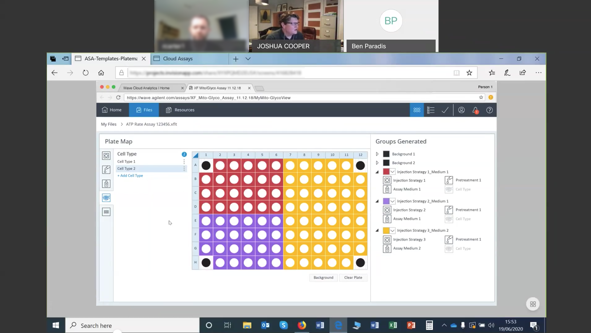
Remote usability testing amidst the pandemic.
With input from product management, I wrote all the test scripts according to the UDC guidelines. All tests were scored using the System Usability Scale (SUS) and Single Ease Question (SEQ) methods. We were happy to report that it received well above a passing score and validated our concept.
Development
Initially, designs were handed off to the development team as marked up files (shown below) but then moved to XD prototypes in Developer mode.
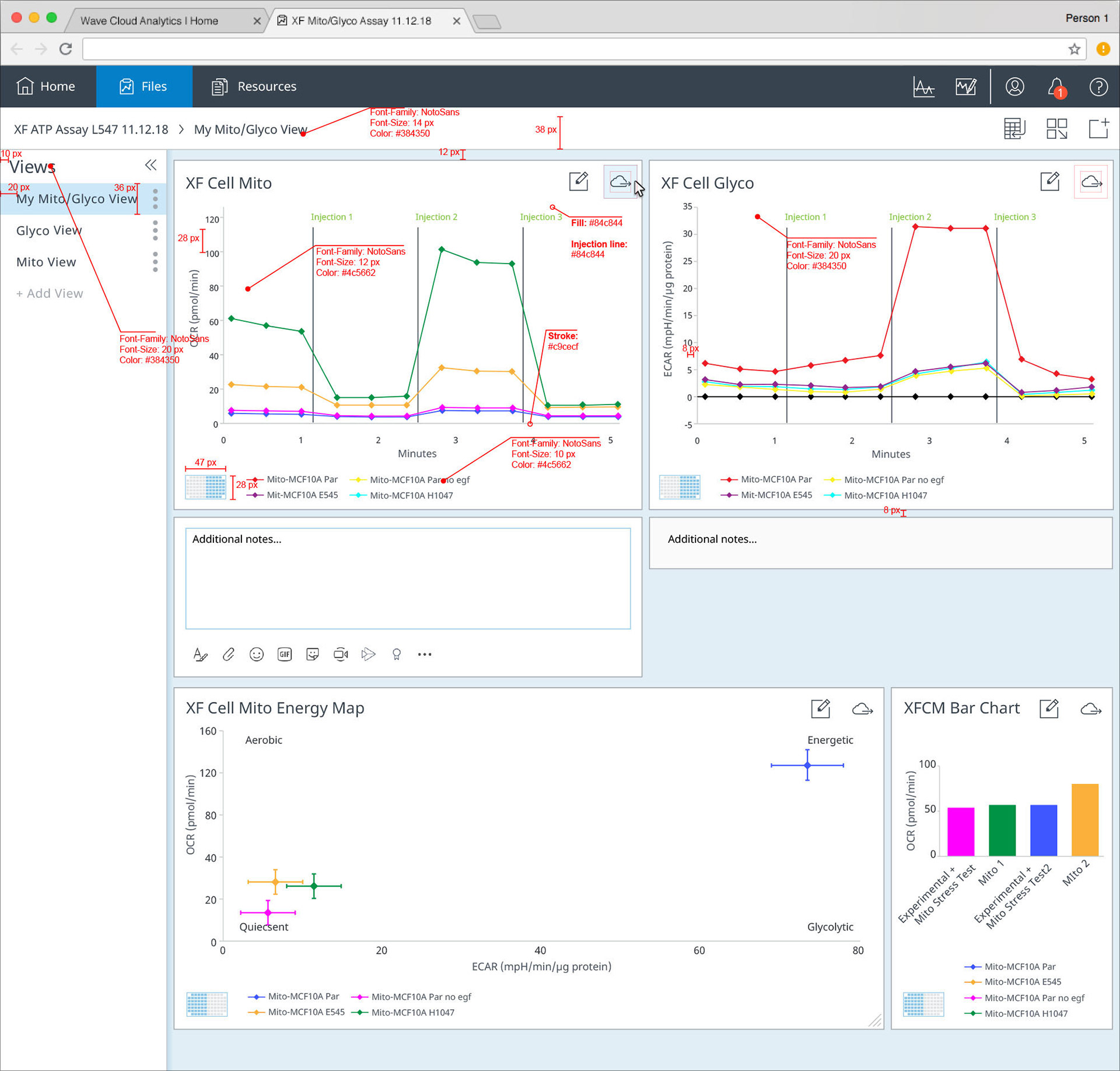
Earlier prototypes screens were shared as marked up PNGs to ensure correct specs.
Design Validation and the QA Process
Once designs started being shared with dev and coding began, it was important to validate that the coded software matched the design files. At Seahorse, and even more so in some other of my Agilent projects, we integrated the design validation step into the Agile development cycle by making a part of the Jira QA Process. The UX design team signed off on all sprint issues as they were completed and identified if any fixes were required.
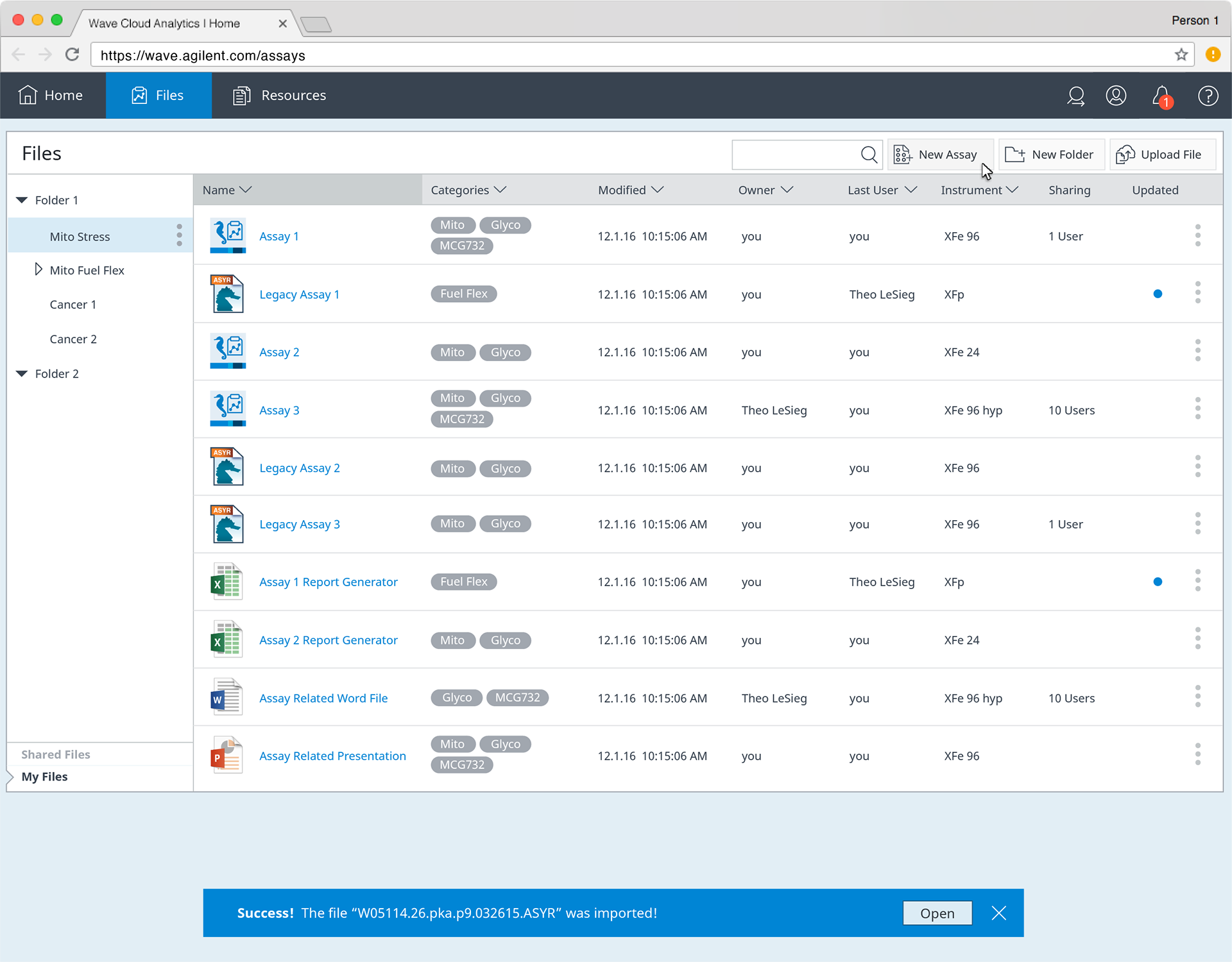
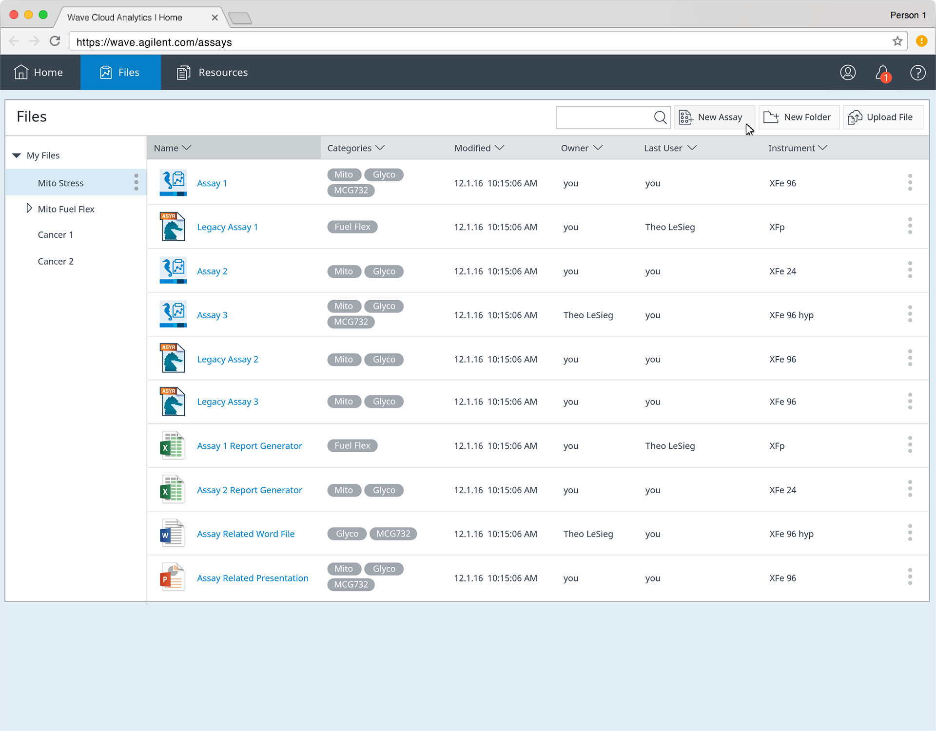
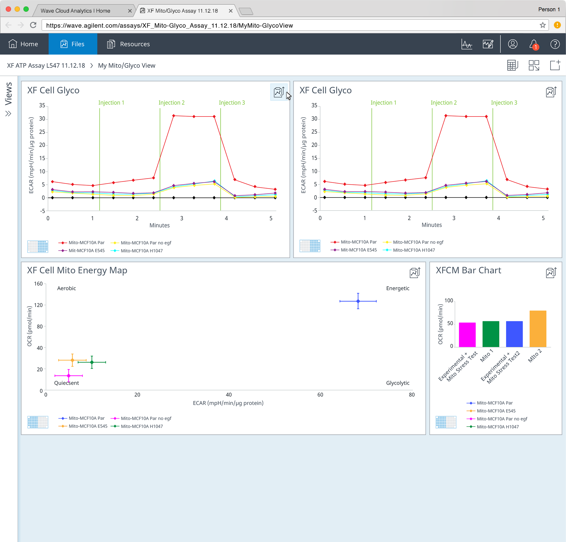
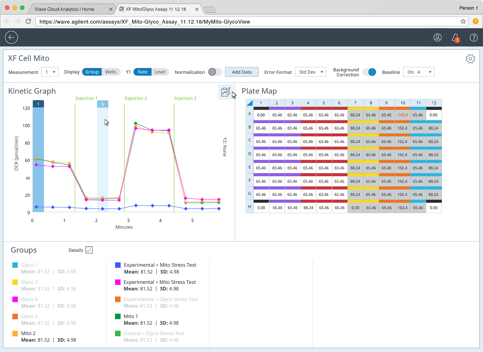
The Final Result
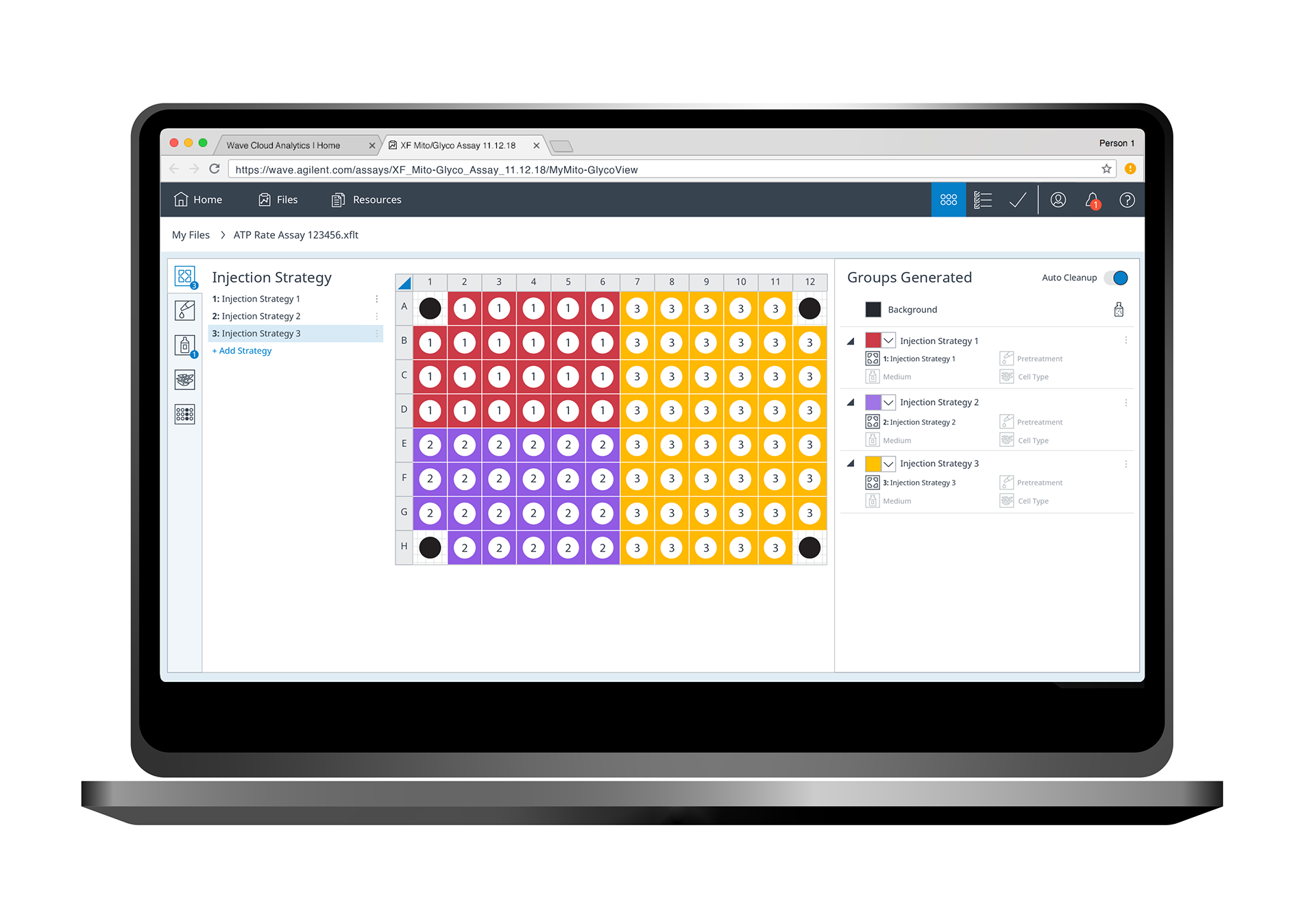
The Seahorse Analytics software has been under active development for the last 7 years and I am proud to be the lead designer for the project. It has gone through many releases, some of which I detail in other portfolio sections, and is still under active development. I wish that I could share some of my interactive prototypes here but, alas, I cannot due to Agilent confidentiality. However, the full application is available for free online and even has test files to play around with.
The software has received many accolades from the scientific community and is generally regarded as the easiest software to use in the lab. Initially, it may look simple but it hides a great deal of functionality, but that was the whole point. Only give the user what they need in that moment.
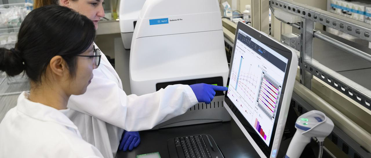
See the link to visit the site and a screenshot of the live software below.

Seahorse Analytics live site.