
Here is what our user wants to see...the end state. But how did they arrive at this result?

The user uploads their files to their Seahorse Analytics account.
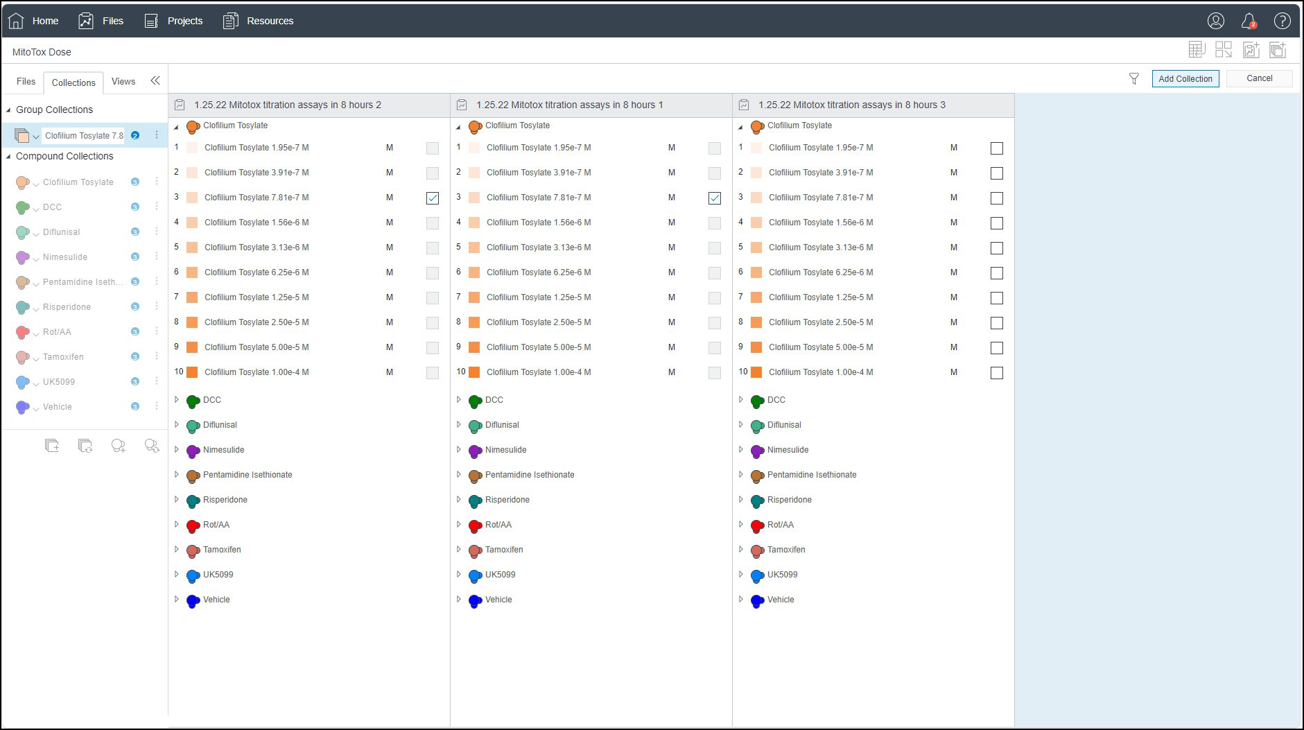
Users will create Group Collections. This was useful if a user had run an experiment with the same groups multiple times (over several days, for instance). We introduced logic in the UI that would disable incompatible selections while the user is building their group collections.
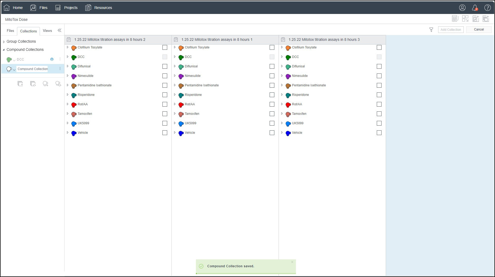
The interface allowed also allows users to select compounds from multiple experiments into compound collections for different type of analysis called Dose Response. We introduced a number of rules and logic to ensure that only compatible compound collections could be created.
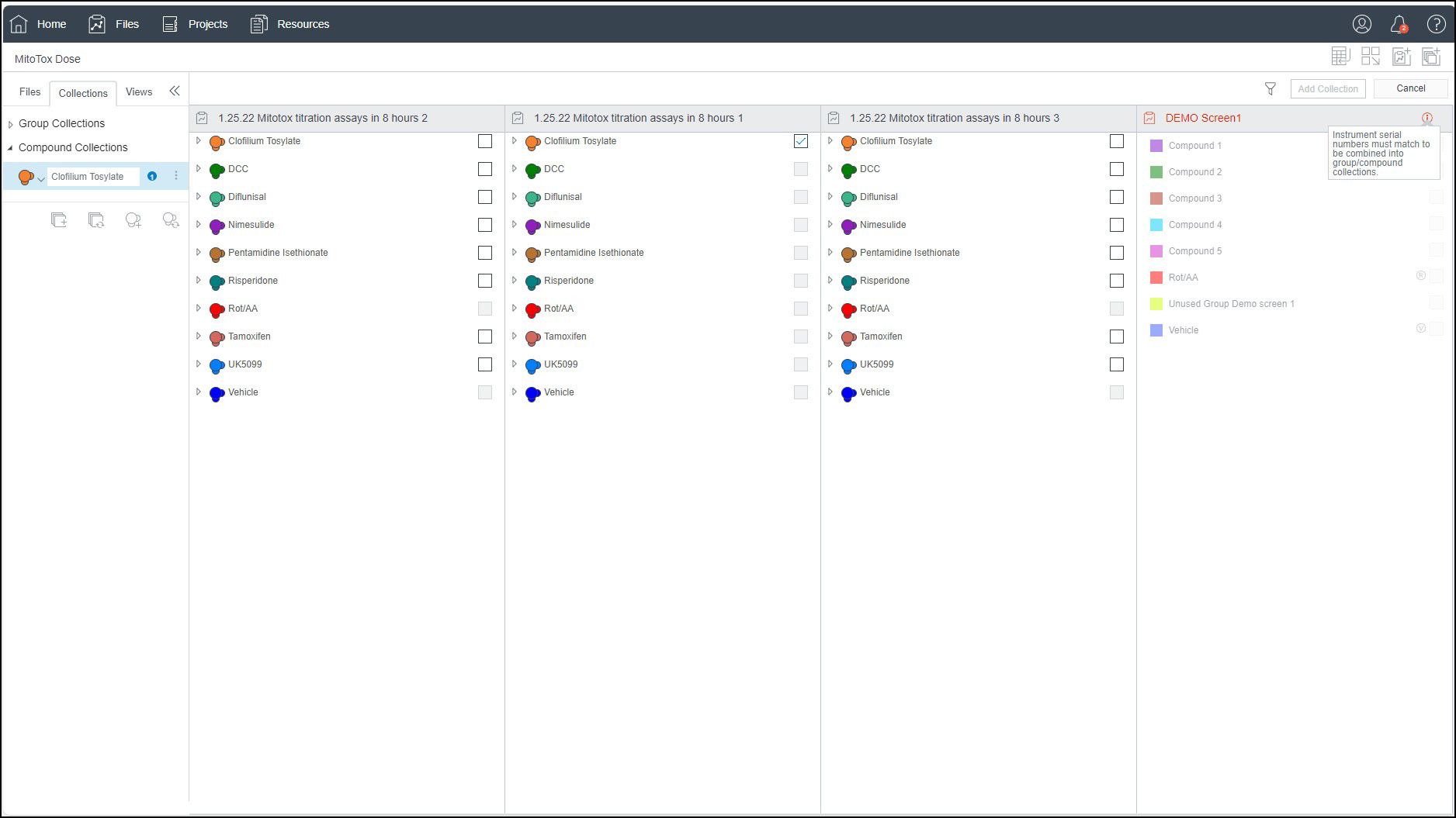
To ensure data integrity, the UI required that data be acquired on the same instrument to be used in compound collections.
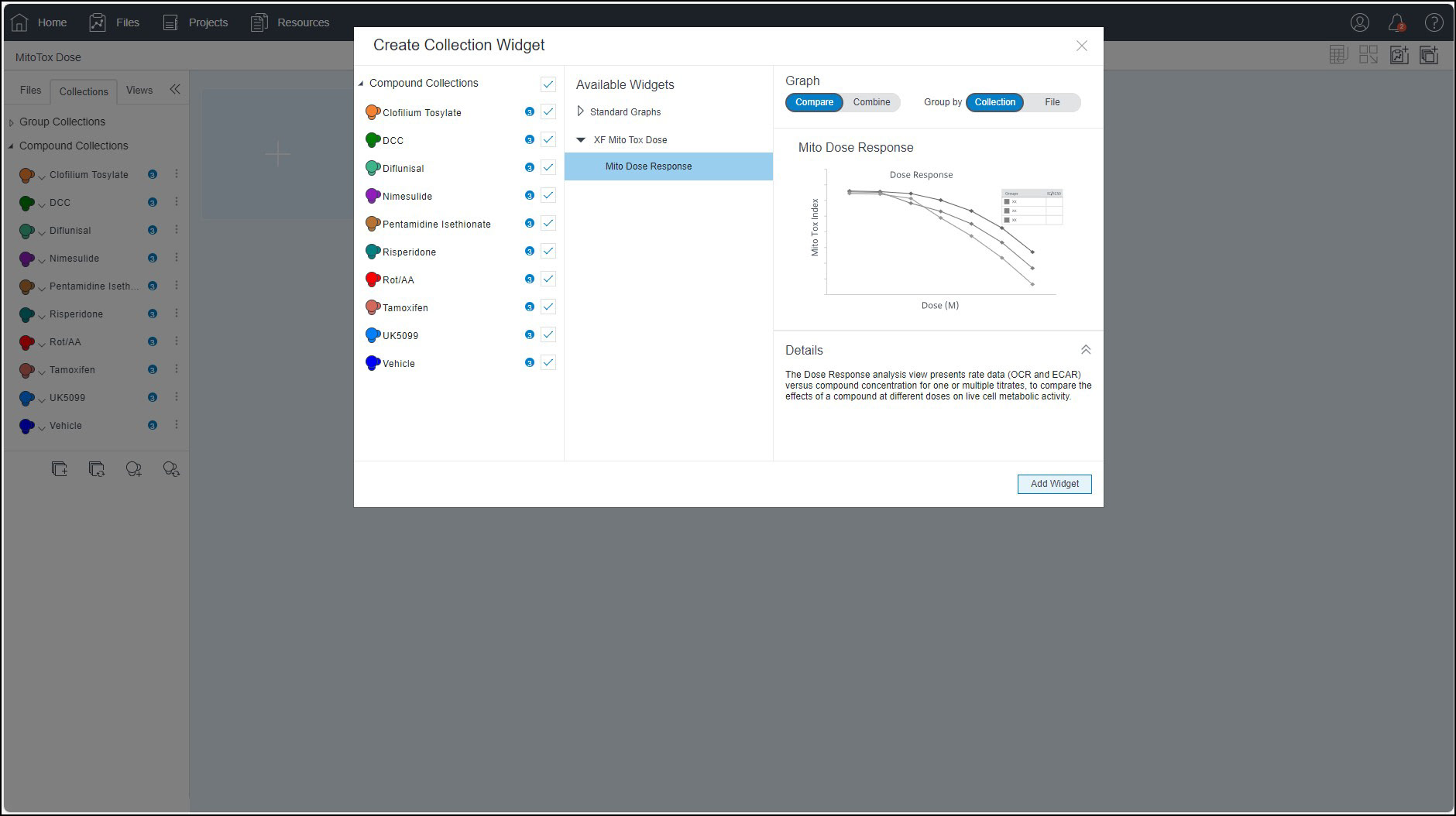
Collections could then be used to create a Widget that would display the data in a graph. Once again, the rules and logic we created restricted the type of graphs available to ensure that only compatible graphs are available to the user.

After choosing a graph, a user gets a preview of what it will look like and the interface allows them to edit the it to display the data in the format that they require.
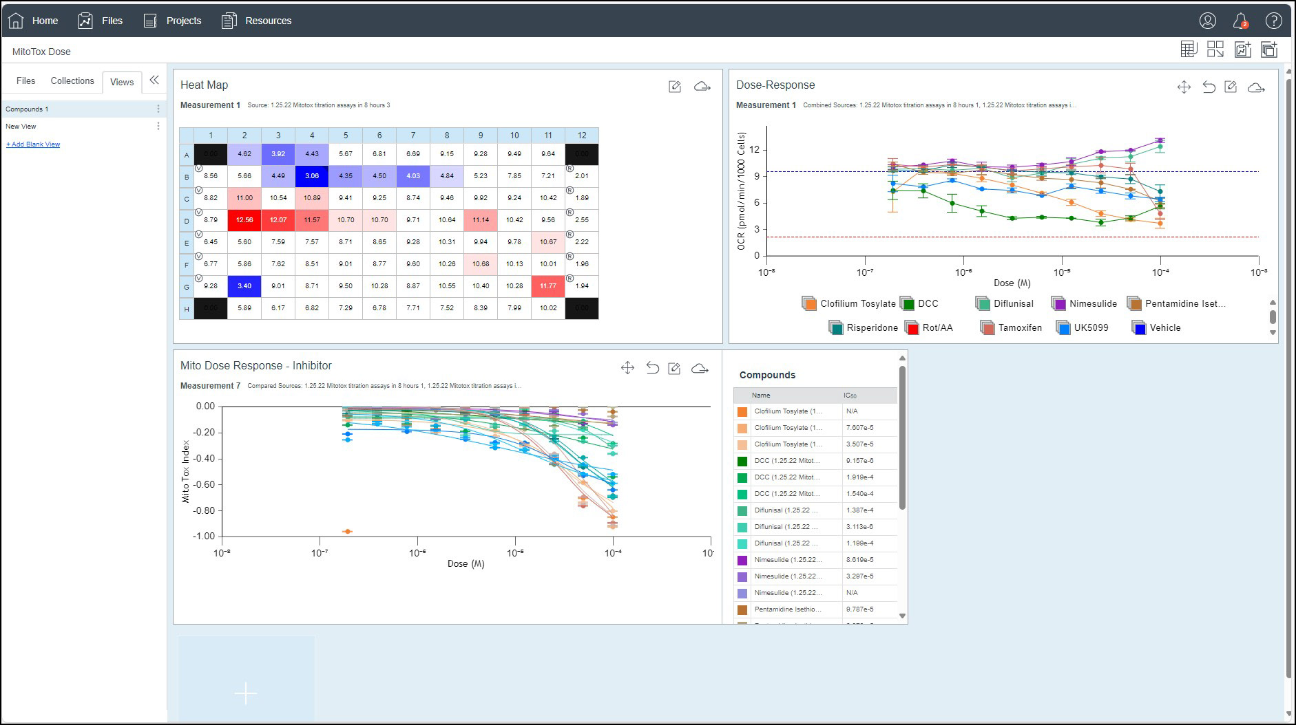
And that brings us back to our result. A view that shows multiple graph widgets. These widgets are based on a grid and can be moved and sized to create a custom view.